GERMANY
Occupations, 1934
First issued: 5 November 1934
Currency: German reichsmark (100 pfennige = 1 reichsmark)
Production: Reich Printing Works, Berlin
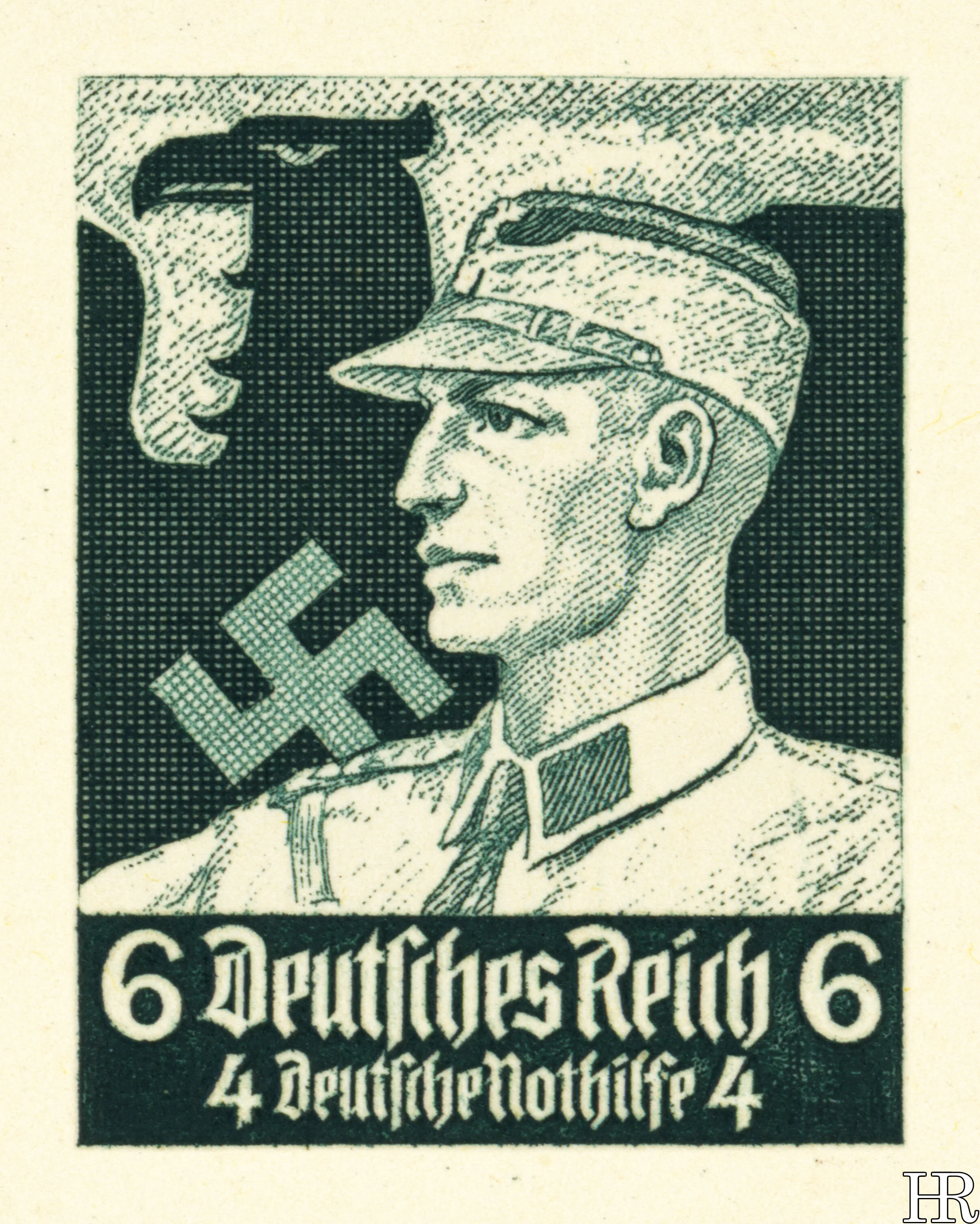
A postcard, in the same style as the series, and depicting a “brownshirt”, was released alongside the stamps. This relatively low-key employment perhaps reflects the régime’s ambivalence about its street-fighting background now that it was comfortably in power. And, certainly, a paramilitary is a poor fit with the “society working as intended” ambience the rest of the set gives off.
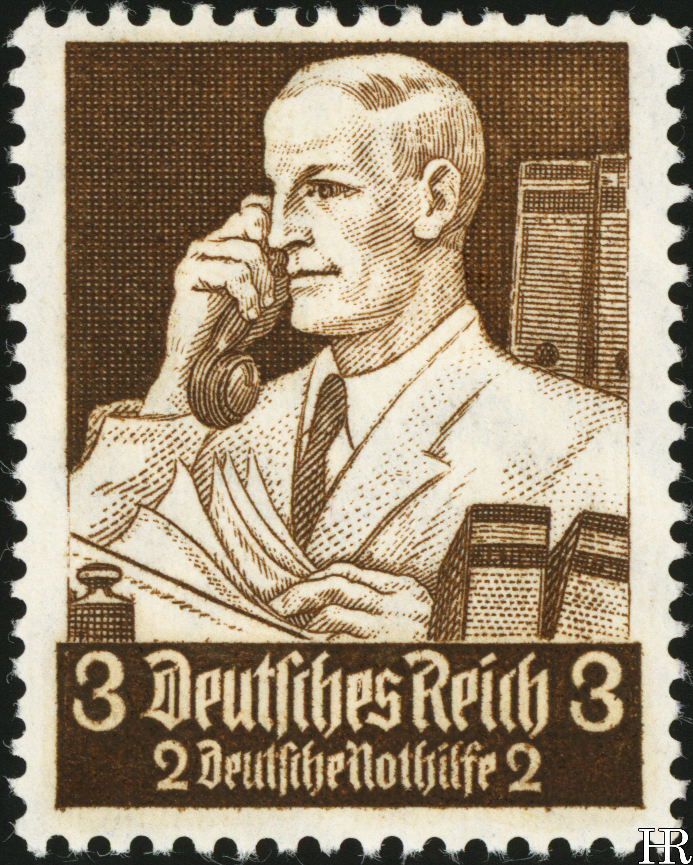
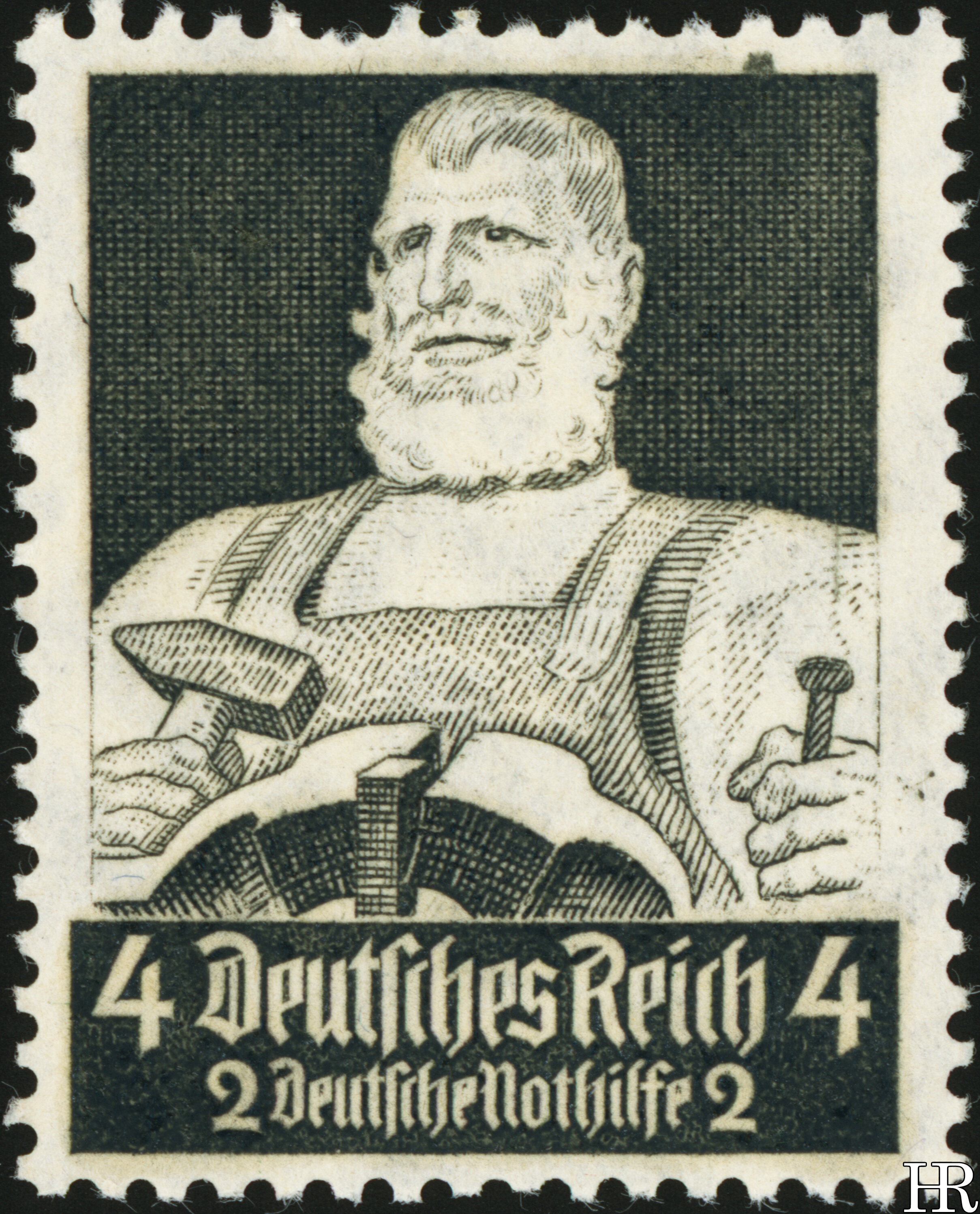
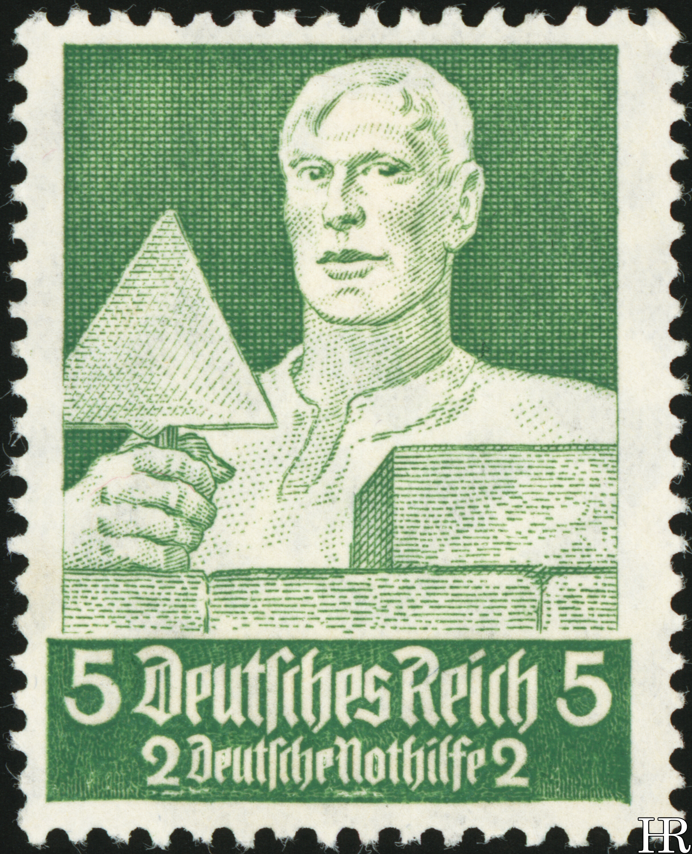
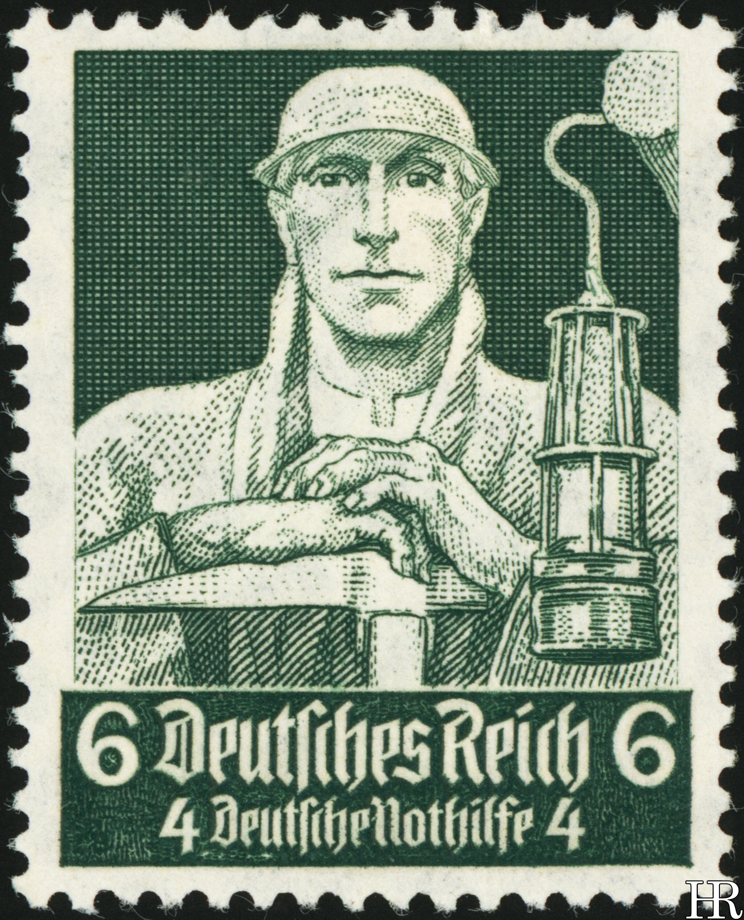
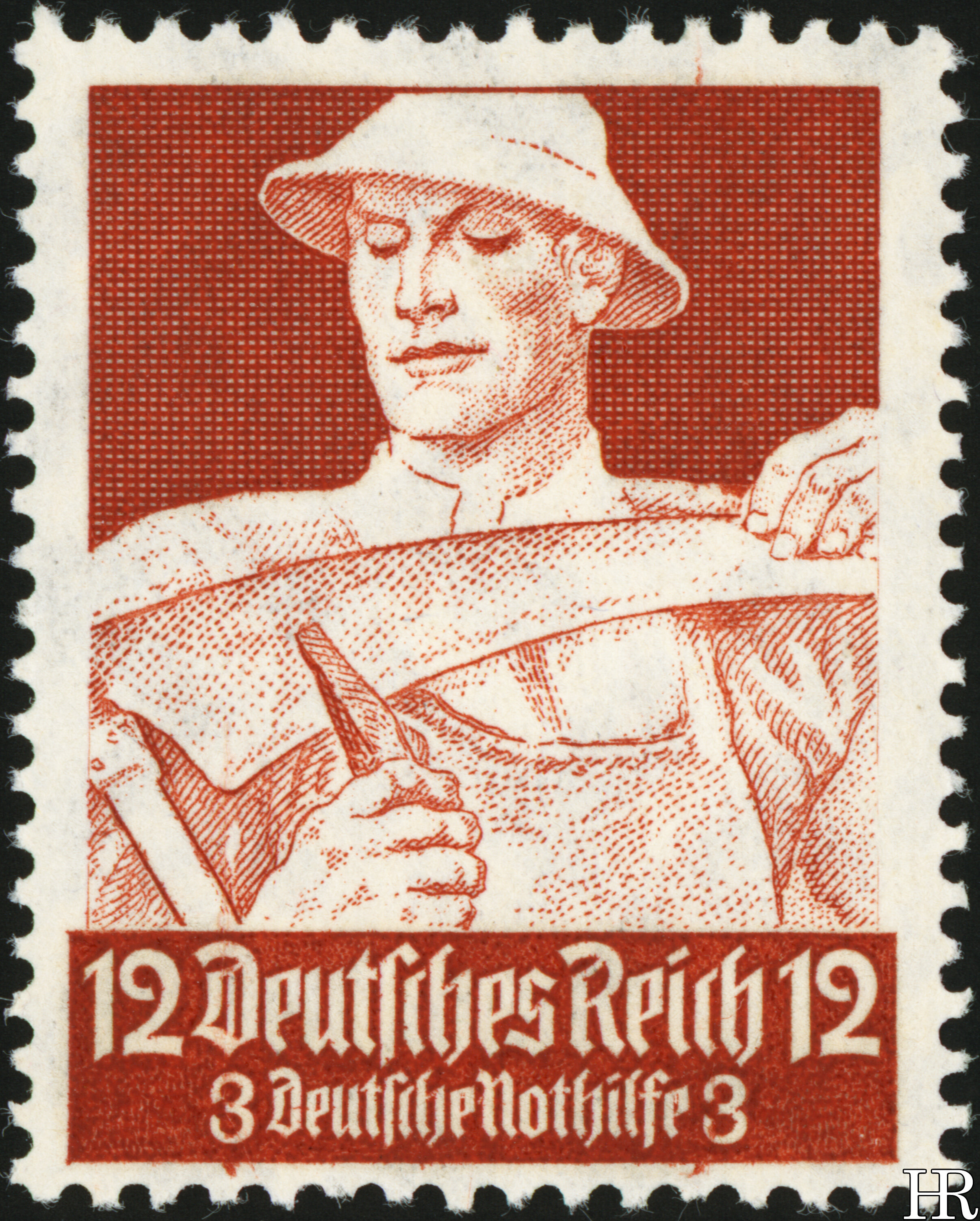
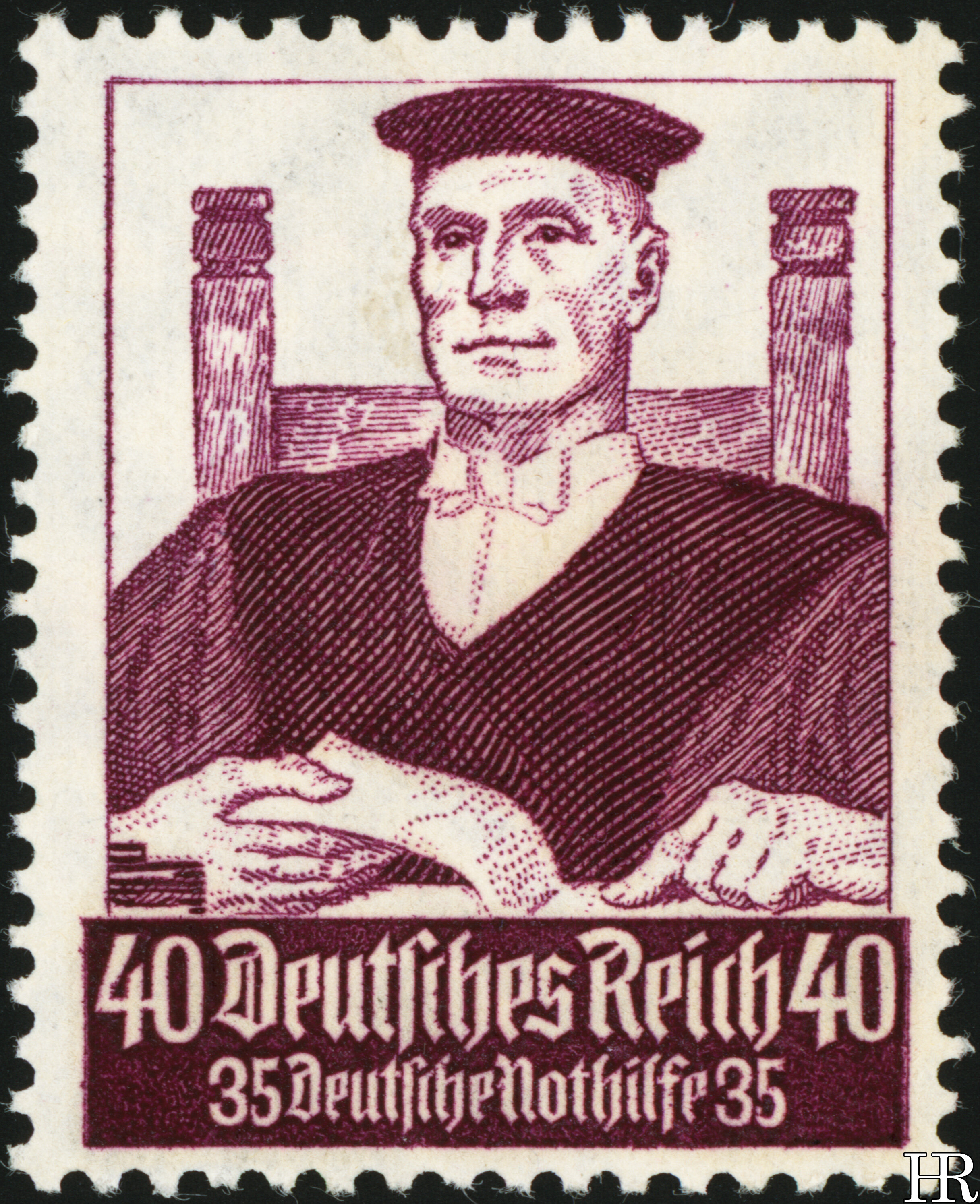
A rather charming ensemble, I must guiltily admit. These have that sort of neat, toy-town quality to them: an assemblage of healthy, masculine members of the national community, each contentedly playing his role. Probably these are much more effective as propaganda than the stern military scenes we would get a decade later. The only overt Nazi element is the SA man, and he, interestingly, is relegated to the accompanying postcard (see right) and doesn’t intrude into the stamps themselves. In hindsight, although the judge here has a kindly mien, it’s hard not to see the shadow of Roland Freisler lurking around.
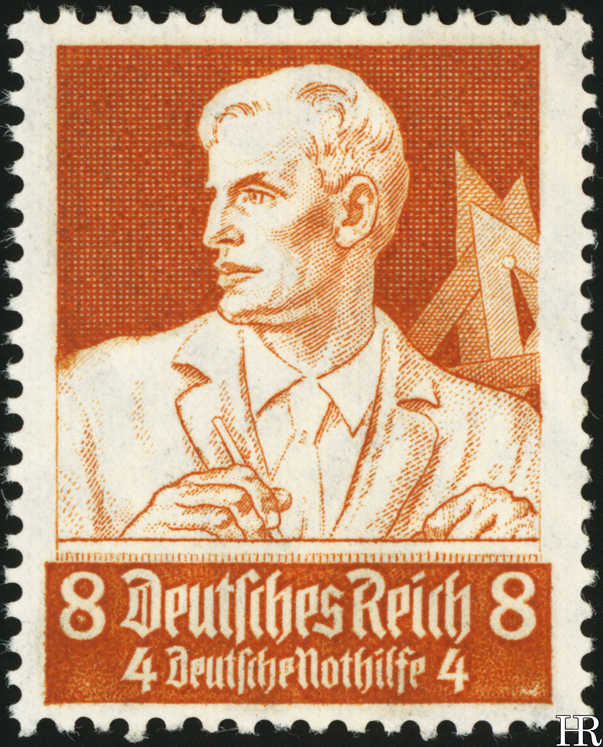
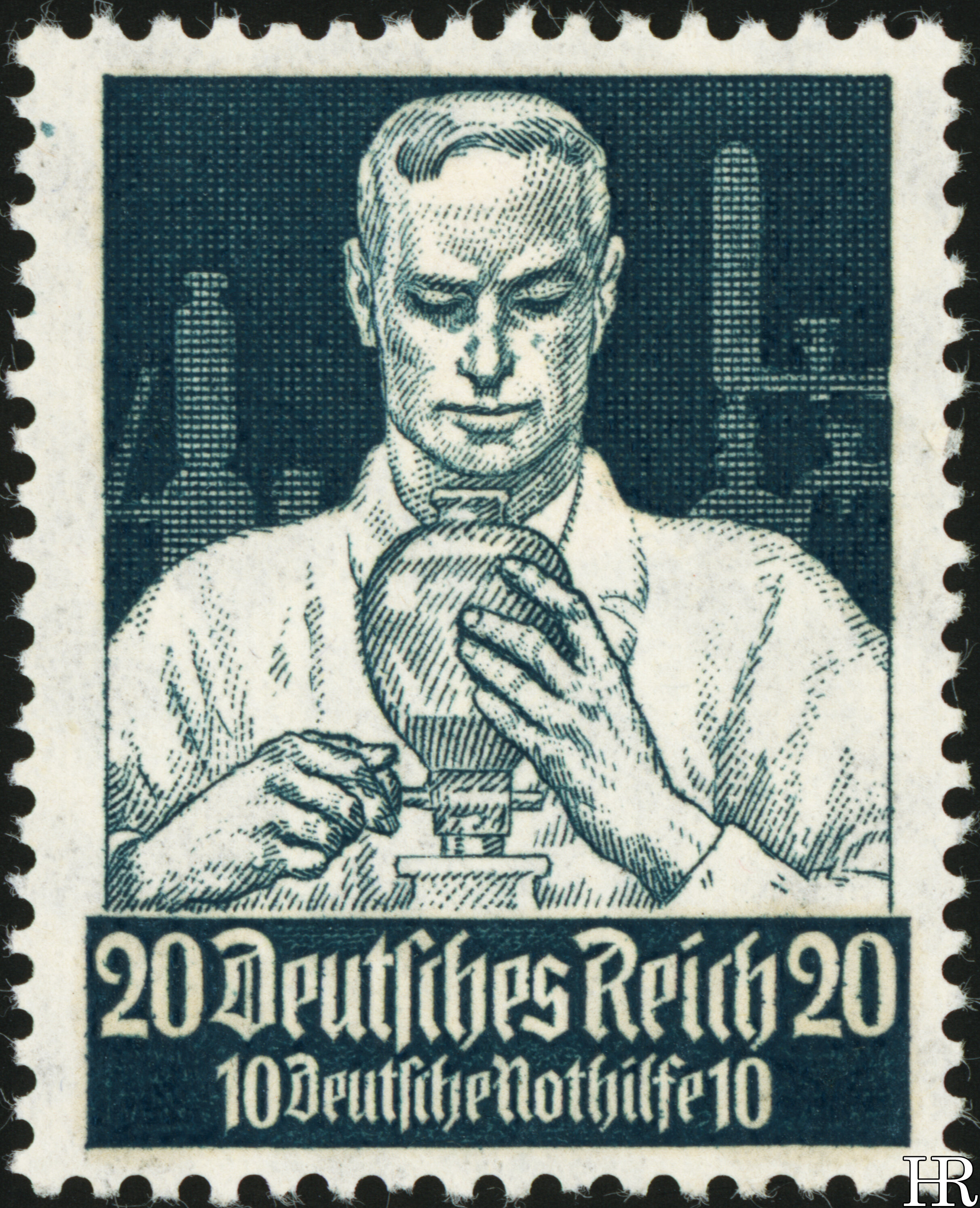
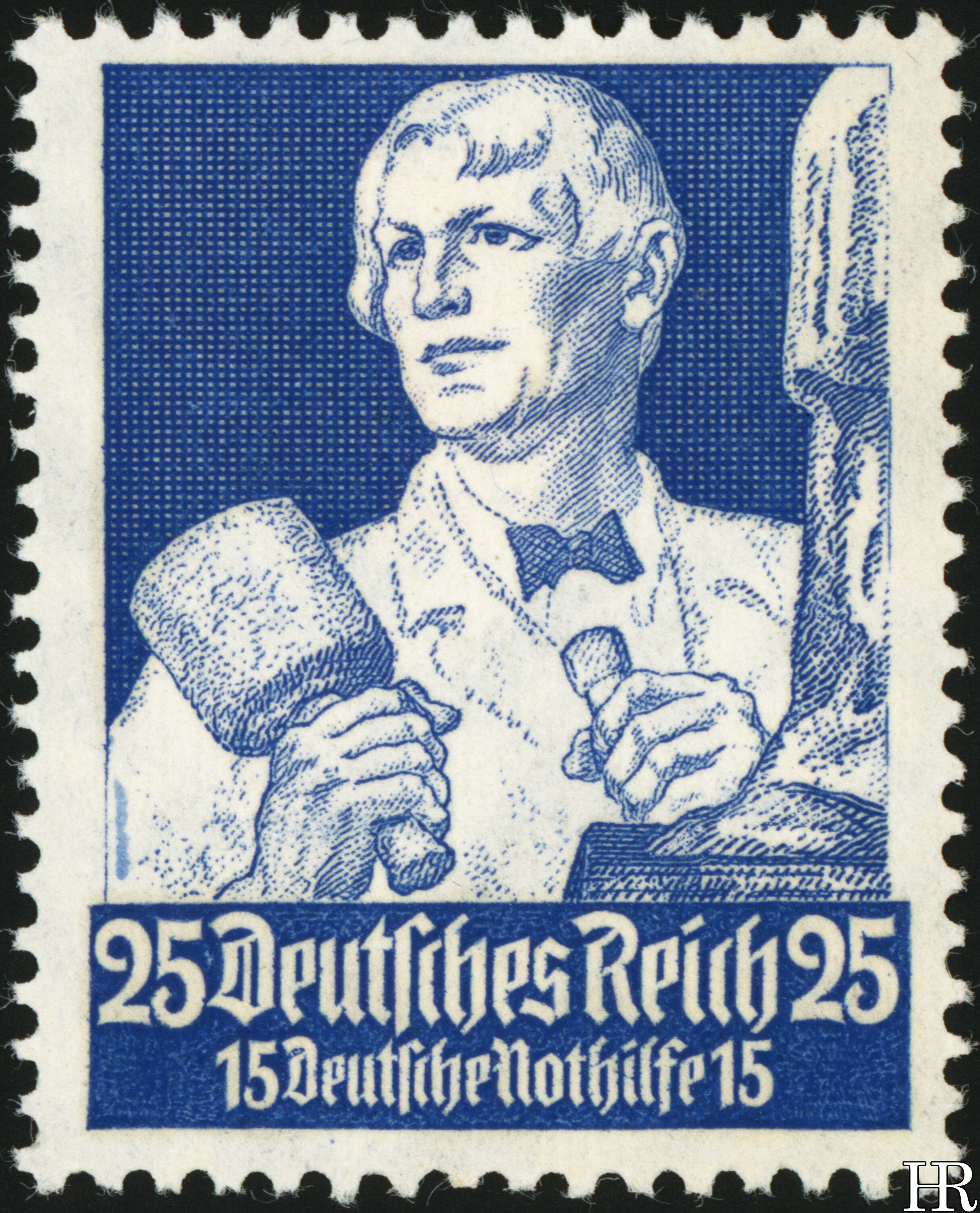
Artistically I think these are successful, though the “heroic” features perhaps work less well on the profile views. Stylistically these are of course entirely in the völkisch idiom, and are a good reminder that official taste in Nazi Germany was often highly kitsch and provincial. The unlined background distinguishes the top value nicely. The set’s designer was Ferdinand Spiegel, who was well-liked by the régime. A couple of the occupations here become slightly obscure in translation. The 8pf. man is a baumeister, which supplies no exact English equivalent — the sense seems to be, the man actually on the spot supervising the works, and not necessarily the person who originally drew the plans up. On the 5pf. is a maurer, which can mean anything from a stonemason to a humble bricklayer. The 20pf. depicts a forscher, literally a “researcher”, and the 25pf. is an “artist”, though evidently we see a sculptor on the stamp.
These stamps, like many issued in the Nazi years, are semi-postals, with a surcharge for the benefit of the “Deutsche Nothilfe”, a general charity-welfare organisation which had existed since 1923. In 1933 it (and all other charities) were folded into the official Party charity, which operated the better-known “Winter Hilfswerk”. The amount of the charity surcharge is worth noting — although it mostly scales proportionate to the amount of postage, the 12pf. has a relatively low surcharge of 2pf. This was the common workhorse internal-letter stamp, and perhaps it was thought that a disproportionately low surcharge would make it more accessible. In general, the stamps seem to have been printed in amounts proportionate to their usefulness. The 12pf. was the most prolific value, followed by the 6pf. which paid the local letter rate.
15 March 2021

